One of the most frustrating moments in stock photography is realizing that photos that sell are often not the ones you worked the hardest to perfect. At some point, however, nearly every photographer asks the same question: why does this image sell when that one does not? The answer usually has nothing to do with sharpness, dynamic range, or artistic merit. Ultimately, it comes down to how buyers actually use images.
In this post, instead, we are going to step away from camera settings and editing sliders and focus on buyer psychology. You will learn why commercial usefulness beats visual impact, why negative space matters more than drama, and why predictable images often outperform creative ones. If you shoot stock, architecture, or commercial-friendly landscapes, this shift in thinking can dramatically change what you choose to photograph.
The Difference Between a Good Photo and a Useful Photo
A good photo is one that impresses photographers. A useful photo is one that solves a problem for a buyer. As a result, this difference explains why photos that sell consistently are not always the most impressive ones.
Most stock buyers are not photographers. Instead, they are designers, marketers, editors, or small business owners. Rather than looking to admire your work, their goal is to communicate a message quickly and clearly.
A technically excellent image can fail commercially if it does not leave room for text, feels too specific, or carries a strong emotional tone that does not match many use cases. Meanwhile, a simple image with clean lines, even lighting, and neutral mood can be reused across dozens of contexts.
For this reason, stock libraries are full of images that feel plain at first glance. They are intentionally flexible.
Buyer Intent Always Beats Artistic Intent
When someone licenses a stock photo, they usually already know what they want to say. The image supports the message. It is not the message itself.
By contrast, strong artistic photos often tell their own story. That makes them harder to repurpose. A dramatic sky, intense color grading, or unusual composition can lock the image into a single emotional narrative. That limits who can use it.
Commercial buyers prefer images that stay out of the way. Neutral lighting. Natural colors. Straightforward compositions. These give them control over how the image is used.
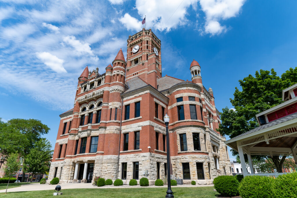
This is especially true for architecture and civic buildings. A courthouse photographed under dramatic storm clouds may look powerful, but a clean, evenly lit version with blue sky will almost always outsell it. The second image works for government reports, educational materials, local news, and business websites. The first one works for a very specific story.
Why Negative Space Sells

One of the biggest predictors of stock sales is usable space. Designers need room for headlines, logos, and copy. Tightly framed or visually busy images create problems for layout.
For example, this is why images with large areas of sky, blank walls, roads, or open fields perform so well. They are not empty. They are functional.
Many photographers instinctively try to fill the frame. For stock, this often hurts sales. Leaving space is not a mistake. It is a feature.
If you ever wonder why a simple photo keeps selling, look at where text could be placed. Chances are the answer is obvious once you think like a designer. Many of the highest-earning photos that sell year after year succeed largely because they leave room for design.
Predictability Is a Feature, Not a Flaw
Photographers are often taught to avoid clichés. Stock buyers rely on them.
Predictable visuals communicate ideas instantly. A courthouse that looks exactly like what people expect a courthouse to look like is useful. A road that clearly reads as a road. A business building that looks professional and neutral.
These images do not stand out in a portfolio review. As a result, they stand out in search results because they match what buyers type into search bars.
This is one reason your county courthouse images align well with stock demand. They are recognizable, geographically relevant, and easy to understand. They do not require explanation. This is the same reason consistent, straightforward compositions work so well in my architecture and civic photography work, where clarity and recognizability matter more than dramatic flair.
Why “Boring” Images Become Photos That Sell
Impressive images tend to have strong personality. Strong personality narrows the audience.
In practice, photos that sell tend to be the ones that adapt easily to many different uses.
Boring images feel adaptable. They can be cropped, color-adjusted, overlaid with text, or paired with almost any message. That flexibility is what sells.
Think about how often your most dramatic photos would realistically be used by a business. Now think about how often a clean, evenly lit exterior of a public building could be reused. Reports. Websites. Presentations. Educational content. News articles. The second image wins every time.
This is not a failure of creativity. It is a different market.
Technical Perfection Is Not the Deciding Factor
Once an image meets baseline quality standards, technical improvements have diminishing returns.
Sharpness beyond what is needed does not increase sales. Extreme dynamic range rarely helps. Subtle color accuracy matters more than bold grading.
Many top-selling stock images would never win photography awards. They are simply correct. Proper exposure. Straight lines. Realistic color. Clear subject.
For that reason, editing for accuracy often beats editing for impact. Subtle, realistic adjustments tend to age better and feel more trustworthy to buyers, which is something I go deeper into in my post on editing for natural color accuracy.
Stock Buyers Think in Layouts, Not Photos
A helpful mental shift is to stop asking, “Is this a great photo?” and start asking, “Where would this be used?”
Would it work as a website hero image? A brochure background? A report cover? A blog header?
Images that answer those questions easily tend to sell. Images that require explanation tend not to.
This mindset also explains why centered compositions often perform well in stock, even though photographers are told to avoid them. Centered subjects are easy to crop and adapt to different aspect ratios. Designers appreciate that flexibility. This approach aligns closely with how stock platforms evaluate commercial usability, as outlined in the Adobe Stock contributor guidelines.
What This Means for Your Shooting Strategy
If your goal is stock sales, therefore, you do not need to stop making beautiful images. You do need to separate which images are meant for art and which are meant for use.
When shooting for stock:
- Prioritize clarity over mood
- Leave space intentionally
- Shoot neutral versions first
- Avoid over-editing
- Think about reuse, not uniqueness
Your most consistent sellers will likely be the images you spent the least time romanticizing.
The reason some photos that sell outperform better images has little to do with skill and everything to do with purpose. Stock photography rewards usefulness, flexibility, and predictability. What feels boring to a photographer often feels perfect to a buyer.
Once you start evaluating images through the lens of buyer intent, the mystery fades. You begin to see why simple courthouses outsell dramatic landscapes, why neutral lighting beats golden hour extremes, and why space matters more than spectacle.
If you embrace this mindset, you do not lower your standards. You change your target. And for stock photographers, that change can make all the difference.