If you have ever taken a photo that looked too blue or too orange, you have run into white balance. In simple terms, white balance photography is about teaching your camera what “neutral” looks like so colors appear natural. In this post, you’ll learn what white balance is, when to use Auto vs a preset vs Kelvin, and how to correct color in Lightroom in seconds. We’ll walk through real scenes like golden hour, shade, and indoor LEDs, plus common mistakes to avoid. By the end, your photos will look true to the scene – no more mystery tints.
What is White Balance and Why It Matters
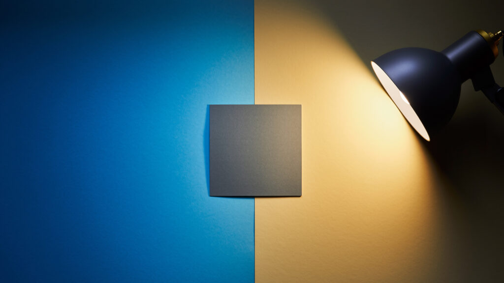
White balance tells the camera how to interpret the color of light. Different light sources have different color temperatures measured in Kelvin. A candle is warm. Open shade is cool. Your camera tries to correct for this so whites look white and skin tones look natural.
- Color temperature basics:
- Candlelight – very warm
- Tungsten bulbs – warm
- Midday sun – neutral
- Open shade – cool
- Overcast – cooler
- LED/fluorescent – varies by bulb
If the camera guesses wrong, your photo can lean blue or orange. That shift can make skin look odd and landscapes feel off. Getting white balance close in camera helps your preview look right and speeds up editing later.
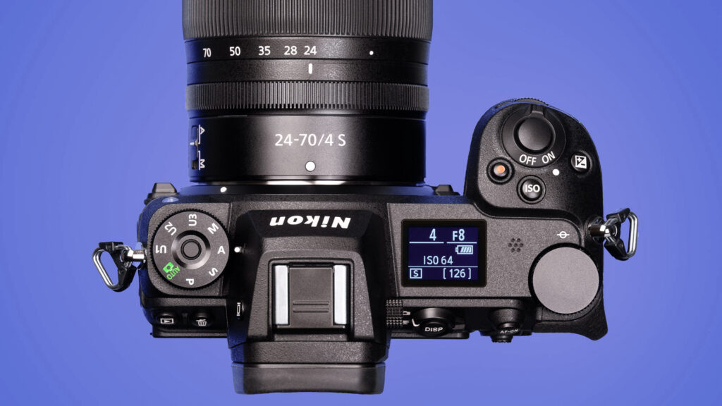
White Balance Options in Camera
You have three practical paths in camera. Each has pros and cons.
1) Auto White Balance (AWB)
- When to use: Changing light like events, street, family moments.
- Pros: Fast and usually close.
- Watch out for: AWB can shift from shot to shot in the same scene. If consistency matters – like a product series – choose a preset or Kelvin.
2) Presets
Most cameras include Daylight, Shade, Cloudy, Tungsten, Fluorescent, and sometimes Flash.
- When to use: Light is consistent and you want steady color across a set.
- Tip: Shade and Cloudy add warmth to counter cool environments. Tungsten cools down orange indoor light.
3) Kelvin (Manual)
You dial in a number, often from about 2,500K to 10,000K.
- When to use: Controlled shoots, landscapes where you want a specific look, product work.
- Quick guide:
- 2,800K to 3,200K – typical indoor tungsten
- 4,500K to 5,500K – neutral daylight range
- 6,500K to 7,500K – shade and overcast

Bonus: Custom White Balance with a Gray Card
Point the camera at a neutral gray or white card under the same light, set custom WB, and lock in perfect color for that scene. This is great for studio, portraits, and product photos.
RAW vs JPEG – Why It Changes Your Approach
Shooting RAW gives you wide latitude to fix white balance later without hurting image quality. Shooting JPEG bakes the white balance into the file, so changes can degrade color and add banding.
- If you shoot RAW most of the time, pick AWB or a close preset and refine in editing.
- If you shoot JPEG, be more careful in camera – use a preset, Kelvin, or a custom white balance for accuracy.
If you are new to RAW, check out your earlier post on getting started with the format for more flexibility in editing: Shooting in RAW.
Real-World Scenarios and Simple Settings
Golden Hour Landscape
- Problem: Warm light can turn too orange.
- In camera: Try Daylight or 5,200K to 5,800K to keep the warmth without going overboard.
- In editing: Use the Temp slider to fine tune. Nudge Tint if the sky goes magenta or green.
Open Shade Portrait
- Problem: Shade light is cool – skin looks blue.
- In camera: Shade preset or 6,500K to 7,200K.
- In editing: Warm the Temp until skin looks natural, then adjust Tint toward magenta if needed.
Indoor Tungsten or Cozy Lamps
- Problem: Orange cast everywhere.
- In camera: Tungsten preset or 3,000K to 3,200K.
- In editing: Pull Temp cooler. Watch Tint – many home bulbs push green or magenta.
Mixed Light at Events (LED DJ lights plus room lights)
- Problem: Two or more colors hitting faces.
- In camera: Stick with AWB and expose well.
- In editing: Correct overall WB, then use local adjustments to fix problem areas. You can brush a cooler or warmer Temp onto faces lit by a stray light.
Product on a Tabletop
- Problem: You need repeatable color.
- In camera: Use a gray card and set Custom WB.
- In editing: Sample the gray card once, sync the white balance to the whole set.
Fast Lightroom Workflow for White Balance
Whether you use Lightroom Classic or Lightroom, the tools are the same and very fast.
Step 1 – Start with the Eyedropper
Use the White Balance Selector on something neutral – a gray card, a white shirt, or a gray road. If you do not have a neutral object, pick the closest off-white surface and refine.
Step 2 – Temp and Tint
- Temp warms or cools the whole image.
- Tint fixes green-magenta shifts common with LEDs and fluorescents.
Step 3 – Sync Across a Series
Shoot a reference frame first with a gray card. After you set WB for that frame, Sync or Copy/Paste those settings to the rest of the images taken in the same light.
Step 4 – Local Fixes for Mixed Light
Grab a Brush or Radial mask and move Temp a little warmer or cooler on faces or objects that were lit by a different source.
For a complete editing walkthrough including white balance, see your Photo Editing Workflow post for step-by-step organization and edits.
Tips, Common Mistakes, and Pro Moves
Keep It Consistent
If you are shooting a sequence under one light, avoid AWB drifting between frames. Use a preset, Kelvin, or a custom white balance.
Do Not Chase Perfection in Camera if You Shoot RAW
Get close and protect your exposure. You can dial white balance perfectly in editing without quality loss.
Watch the Backgrounds
Neon signs, stage lights, and green walls will influence the look. Plan where your subject stands to avoid mixed color on skin.
Calibrate Your Monitor
Good color on your screen leads to good decisions. A simple calibration tool takes the guesswork out of editing.
Use a Gray Card When Color Must Match
For product listings and brand work, a $10 gray card beats trial and error. Take one reference shot in each lighting setup.
Kelvin Is Creative Too
You do not have to chase neutral. A cooler Kelvin can make predawn scenes feel crisp. A warmer Kelvin can amplify sunset mood. Decide based on the story you want to tell.
Troubleshooting Quick Guide
- Everything looks blue: You likely used too low a Kelvin or set Tungsten under daylight. Raise Temp or switch to Daylight/Cloudy.
- Everything looks orange: You used Shade/Cloudy indoors or set a high Kelvin. Lower Temp or pick Tungsten.
- Greens or magentas in skin: Adjust Tint, not Temp. LEDs often push green.
- Mixed light on faces: Use local Temp/Tint brushes to balance small areas.
- JPEG looks crunchy after WB edits: That is normal. Next time shoot RAW in difficult light or nail WB in camera.
Color is a big part of how a photo feels. With a little practice, white balance photography becomes second nature. Pick the right approach for the scene – AWB for speed, a preset for consistency, Kelvin for control, or a gray card when you need perfect matches. If you shoot RAW, relax and get close in camera, then finish the job in Lightroom with the eyedropper and a quick Temp/Tint tweak. Want to keep building your skills? Revisit the Exposure Triangle to see how shutter, aperture, and ISO shape the shot, and then follow your Photo Editing Workflow to lock in a smooth process from import to export. Natural color is within reach every time you pick up the camera.